PEPSI
A GLOBAL REDESIGN
Strategy Approach
Tone of Voice
Branding & Logo
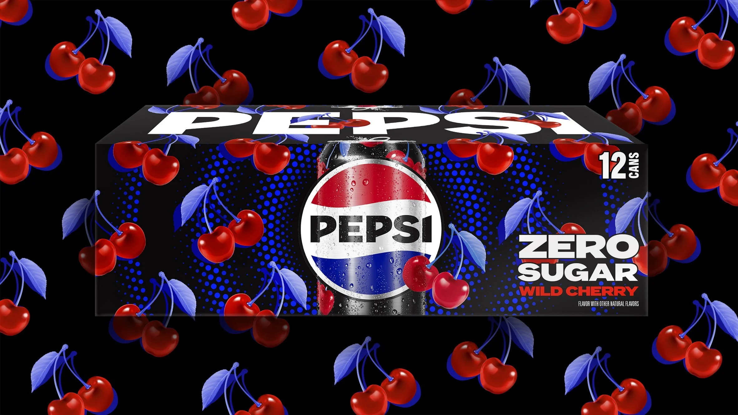
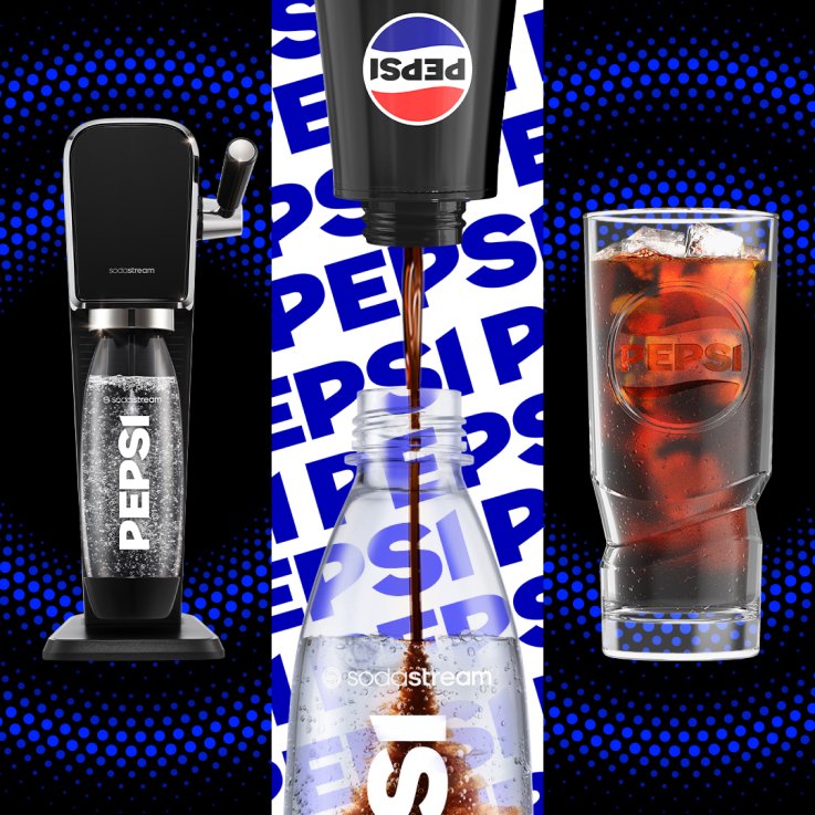
Packaging Design
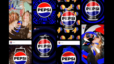
Digital Design
Photography
Advertising
FINDING THE PEPSI PULSE
Pepsi is a brand that never stands still. After 125 years of shaping culture, it was time for its visual identity to evolve again. The Challenge: how do you define the next era of such an iconic global brand? By tapping into Pepsi’s signature challenger spirit, we crafted a refreshed identity that bridges its heritage with a bold vision for the future.
THE IDEA
Pepsi has always propelled culture forward. Our goal for the 2023 global redesign was to celebrate that legacy while building a system ready for what’s next. We reimagined the global visual identity for a cultural icon that transcends generations.


NEW LOOK.
NEW MOMENT.
Pepsi has always pushed culture forward, and in taking on its global redesign, we set out to pay homage to its rich heritage while paving the way toward the future. But before taking on the first evolution of the Pepsi visual identity in 14 years, we had to first dive into the brand's legendary history. From there, we charted our course toward a fresh look and feel that could make its mark the way an iconic brand like Pepsi can.


COLOUR PLAETTE REFRESH
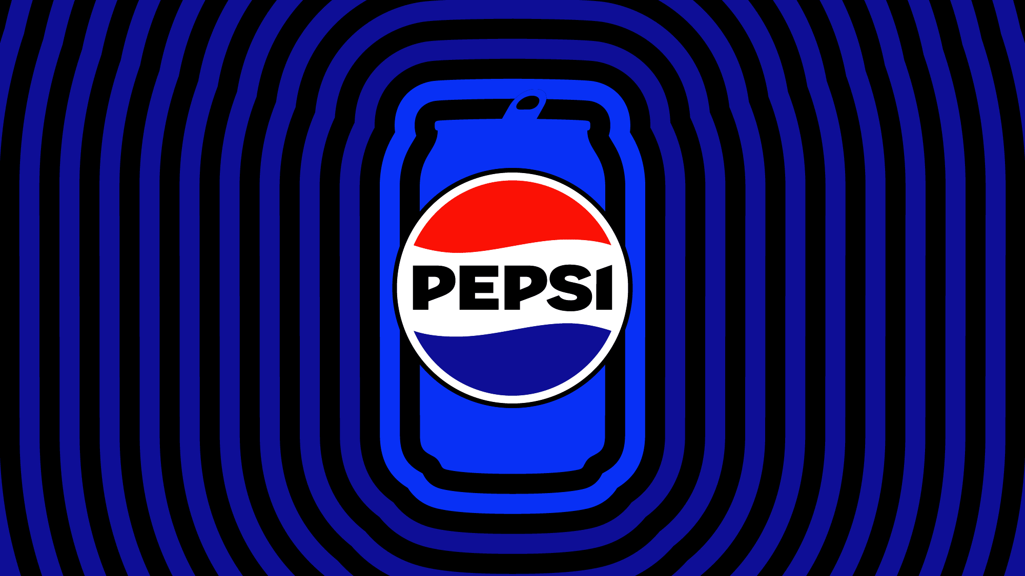
The updated Pepsi palette builds on its iconic red, white, and blue, enhanced with a more vibrant “electric blue” that injects energy and digital brightness across the system. Black is introduced as a core brand colour, adding contemporary contrast. Together, these tones create a palette that feels both unapologetically Pepsi and a modern brand expression.
WORDMARK
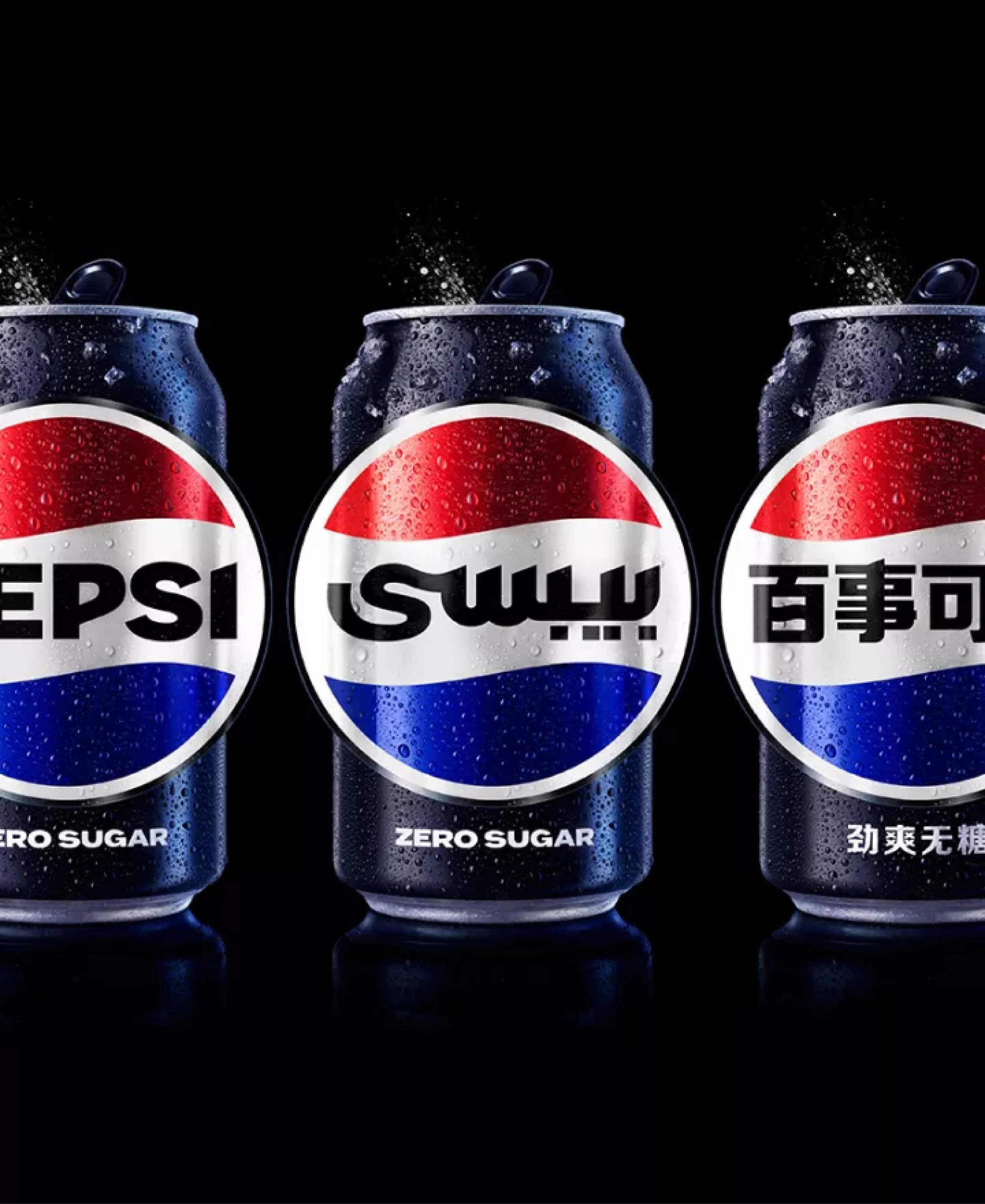
A new custom typeface gives the brand a confident, unapologetic voice with stronger, more assertive forms. The wordmark shifts to a bold, uppercase expression and is reintegrated directly into the Globe, reconnecting the brand to the visual language of its heritage while refining it for today’s communication needs.
THE GLOBE EVOLUTION
The Pepsi Globe is reimagined with subtle refinements that draw from historical wave and stripe cues while optimizing the symbol for motion-first environments.
UNAPOLOGETICALLY CURRENT.
UNDENIABLY PEPSI.
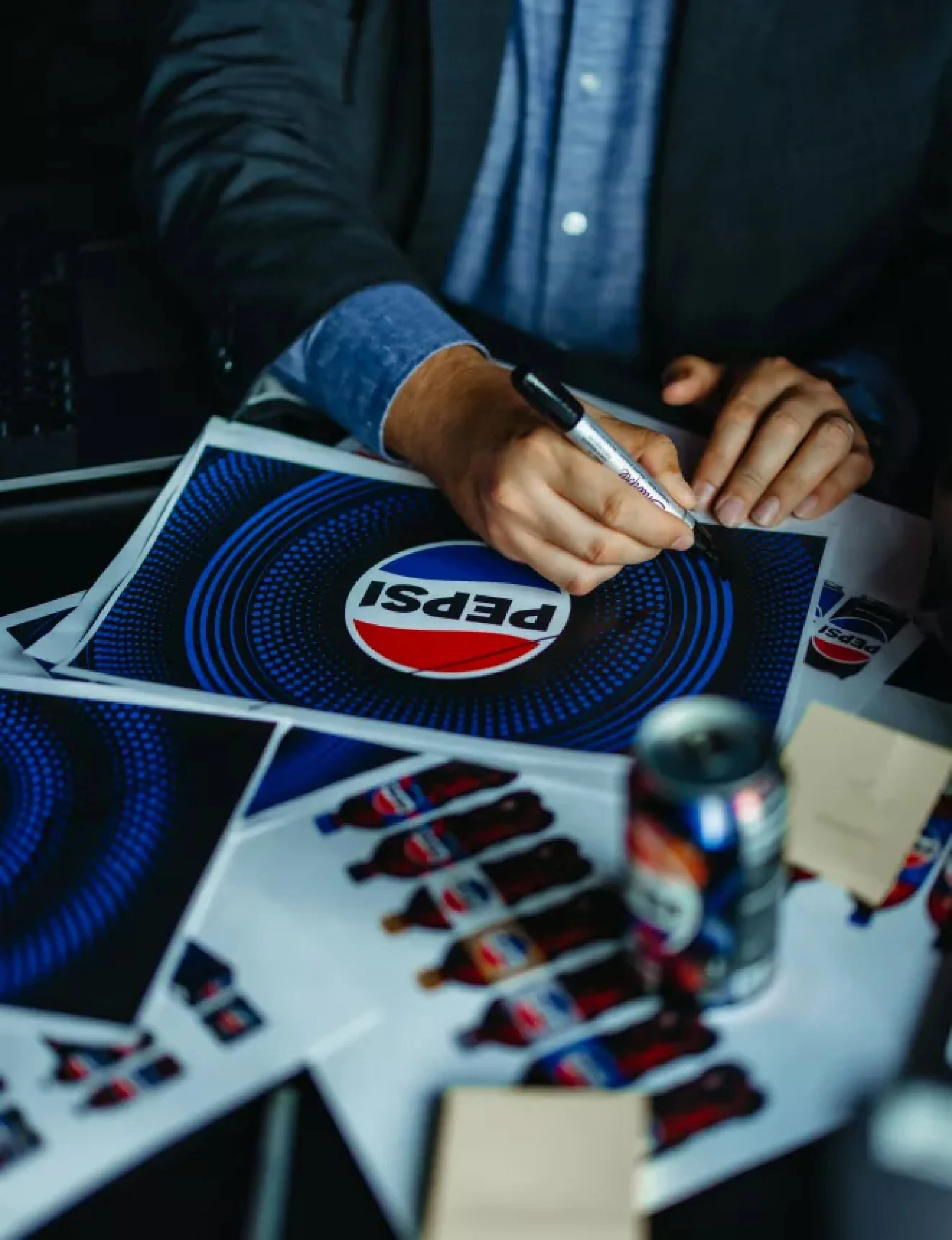
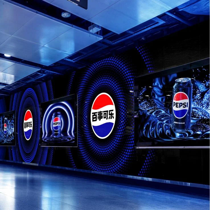
A dynamic “pulse” graphic expands the system’s expressive range, bringing fizz, rhythm, and energy to Pepsi’s digital moments, while elements like the can silhouette strengthen product recognition across packaging, equipment, and experiential spaces. Guided by design thinking processes, we tested and refined the type and palette to ensure each component could flex, extract, and scale effortlessly. The result is a modular visual system that unlocks greater adaptability, allowing Pepsi to move fluidly between digital environments, physical touchpoints, and everything in between.


Work designed at PepsiCo
Credits:
Senior Leadership: Mauro Porcini, Richard Bates, Matthieu Aquino
Senior Design Directors: Carl Gerhards & Shiri Kornowski
Art Director: Leslie Christine Park
Brand Designers: Silvia Lambarri, Stephanie Hsu, Eliza Frye
Merchandise, Uniforms, Motion Toolkits: Trey Veal, Spencer Brokaw, David Schwen, Danielle Paino